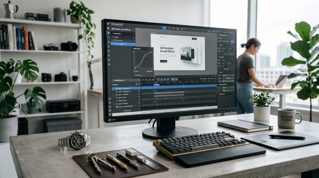
Webflow’s interactions system is one of the platform’s more distinctive features. It lets you add sophisticated animations to your sites without writing JavaScript. Scroll effects. Hover animations. Multi-step interactions. Complex motion design accessible through a visual interface.
For designers who understand what animations should do but do not want to write code, interactions provide significant creative capability. For sites where motion adds real value, Webflow interactions enable results that would otherwise require developer collaboration.
This piece covers how Webflow interactions work, what you can create with them, and how to use them without overwhelming visitors.
What Interactions Actually Are
The basic concept.
Animation & Motion
Interactions add movement and change to your site. Elements moving. Fading. Rotating. Scaling. Changing color. Any visual property can be animated.
Triggered by Events
Interactions happen in response to events. Someone scrolls the page. Someone hovers over an element. The page loads. Mouse position changes.
Each trigger can start specific animations.
Time-Based Sequences
Beyond simple state changes, interactions can sequence multiple animations. First this happens, then this, then this.
Complex choreographed animations become possible.
No JavaScript Required
Webflow generates the code behind the scenes. You define the animations visually. Webflow implements them.
This makes sophisticated animation accessible to non-developers.
The Interactions Panel
Where you build animations.
Access the Panel
In the Webflow Designer, open the interactions panel from the left side.
Two Types
Element trigger interactions: applied to specific elements. Hover, click, scroll into view.
Page trigger interactions: apply to the whole page. Page load, mouse position, scroll progress.
Actions Panel
Once you set a trigger, define the actions. What should animate. How it should animate.
Timeline View
For multi-step interactions, a timeline view shows the sequence of animations.
Basic Element Interactions
Common starting points.
Hover Effects
When someone hovers over an element, animate it. Change color. Scale up. Rotate. Fade related elements.
Common for buttons, cards, and interactive elements.
Click Effects
When someone clicks an element, trigger an animation. Reveal content. Open modals. Change page state.
Different from hover, click implies deliberate action.
Scroll Into View
When an element scrolls into view, animate it. Fade in. Slide from side. Scale up.
Popular for revealing content as users scroll down pages.
While Scrolling In View
Elements can animate progressively as they scroll through the viewport. More sophisticated than simple scroll-into-view.
Page-Level Interactions
Site-wide animations.
Page Load
Animations that play when the page loads. Header appearing. Content revealing. Establishing atmosphere.
Use sparingly. Overdone page loads slow perceived load times.
Mouse Move
Elements respond to mouse position. Parallax effects. Interactive backgrounds. Cursor followers.
Interesting for creative sites. Distracting on most business sites.
Scroll Progress
Elements change based on scroll position. Progress bars. Sticky elements. Parallax between sections.
Powerful for storytelling and long-form content.
Direction Detection
Different animations based on scroll direction. Scroll down reveals one thing. Scroll up reveals another.
Building a Simple Interaction
The basic workflow.
Select the Element
Click the element that will be interactive or animated.
Add New Interaction
In the interactions panel, add a new interaction.
Choose Trigger
Select the trigger type. Hover, click, scroll, page load, etc.
Define Actions
Configure what animates. Which properties change. How they change.
Set Timing
Duration of the animation. Easing (how the motion accelerates and decelerates). Delays.
Test
Preview the interaction. Verify it works as intended.
Iterate
Adjust based on results. Small changes to timing and easing significantly affect how animations feel.
Understanding Animation Properties
What you can animate.
Position
Move elements. X, Y, Z coordinates. Translate elements from one position to another.
Size
Scale elements. Grow or shrink. Change dimensions.
Rotation
Rotate elements. Around any axis. Full rotations or partial.
Opacity
Fade elements in or out. Common for reveal animations.
Color
Change colors of any color property. Background colors, text colors, border colors.
Filters
Blur, brightness, contrast, and other visual filters.
Transform
Skew, warp, and other transformations beyond basic position and rotation.
Timing & Easing
Making animations feel right.
Duration
How long the animation takes. Fast animations feel snappy. Slow animations feel deliberate.
Common durations: 200-500 milliseconds for micro-interactions. 500-1000 for content reveals.
Delay
Wait time before animation starts. Useful for sequencing multiple animations.
Easing
How the animation progresses through time. Linear feels mechanical. Ease-in-out feels natural.
Different easings suit different purposes. Ease-out for elements entering. Ease-in for elements leaving.
The Feel Matters
The same animation with different timing and easing feels completely different. Experiment to find what works.
Multi-Step Interactions
Beyond single animations.
Timeline Concept
Sequence multiple animations. First animation triggers. Second follows. Third follows that.
Building Timelines
Add multiple actions to a single interaction. Set start times or use sequential positioning.
Complex Choreography
Elements can animate in coordinated ways. Multiple things happening simultaneously and sequentially.
When Multi-Step Helps
For complex reveal sequences. Choreographed page loads. Sophisticated hover effects.
When to Keep It Simple
Most interactions should be simple. Simple animations that support content beat complex animations that distract.
Common Interaction Patterns
Widely used techniques.
Fade & Slide Reveals
Elements fade in and slide from a direction as they scroll into view. Standard for content reveals.
Sticky Elements
Navigation, sidebars, or elements that stick to the viewport as you scroll.
Parallax Effects
Background images scroll at different speeds than foreground content. Creates depth.
Hover Card Effects
Cards that lift, scale, or otherwise respond when hovered.
Sequential Reveals
Multiple elements reveal one after another as content scrolls into view.
Number Counters
Numbers that count up when they scroll into view. Common for statistics.
Progress Indicators
Bars that fill as you scroll through a page. Show progress through long content.
Performance Considerations
The trade-offs of animation.
Every Animation Costs
More animations mean more code, more processing, more potential for slowdowns.
Sites with many complex animations can feel laggy, especially on mobile devices.
Testing on Mobile
Animations that feel great on desktop can feel bad on mobile. Test on actual mobile devices.
Reducing Impact
Simpler animations perform better than complex ones. Fewer simultaneous animations perform better than many.
When to Skip Animations
Some users prefer reduced motion. Respect the prefers-reduced-motion setting when possible.
For accessibility, consider users who find motion distracting or nauseating.
Design Principles for Interactions
Making animations work.
Serve the Content
Animations should support content, not distract from it. Motion that helps users understand or engage.
Consistency
Similar elements should animate similarly. Consistent motion language creates polish.
Restraint
Less is often more. Sites with a few well-executed animations often feel better than sites with many mediocre ones.
Purpose
Every animation should have a purpose. Attention. Feedback. Delight. Understanding. Random motion for its own sake distracts.
Timing
Right timing makes animations feel natural. Wrong timing makes them feel awkward.
Progressive Enhancement
Sites should work without animations. Animations enhance experience but not require it.
Common Interaction Mistakes
Users stumble in predictable ways.
Too Many Animations
Every element moving. Every interaction elaborate. Overwhelming users.
Slow Animations
Long duration animations that make sites feel slow. Users wait through animations.
Wrong Easing
Linear easing on everything. Mechanical feeling motion.
Ignoring Performance
Building elaborate animations without testing performance. Sites feel laggy.
Distracting Motion
Animations that pull attention from content. Users lose focus on what matters.
Inconsistent Motion Language
Different animations styles throughout the site. Feels chaotic.
Accessibility Ignored
Motion that causes problems for users with vestibular sensitivities.
Overusing Parallax
Parallax everywhere. Overwhelming and sometimes disorienting.
When Interactions Add Value
Situations that benefit.
Storytelling Sites
Long-form narrative content where motion helps guide readers.
Product Showcases
Revealing product features progressively. Motion helps demonstrate.
Portfolio Sites
Designer and creative portfolios where motion is part of the demonstration.
Marketing Landing Pages
Where motion draws attention to key messages.
Content Reveals
Where content sections benefit from being revealed rather than just appearing.
When Interactions Do Not Help
Situations that suit simpler approaches.
Content-Heavy Sites
News, publications, documentation. Users want content, not entertainment.
Utility Sites
Tools, applications, calculators. Function matters more than motion.
E-commerce
Product pages should focus on selling, not entertaining. Some interaction is fine. Too much distracts.
Sites for Slower Devices
If your audience uses older devices, elaborate animations may perform badly.
Accessibility-Focused Sites
Sites serving audiences with specific accessibility needs may want minimal motion.
Learning to Build Interactions
Skill development.
Webflow University Interactions Course
Official course covers interactions from basics to advanced. Free and thorough.
Cloneable Interaction Examples
Webflow’s community shares interaction examples you can clone and modify. Great for learning.
Building From References
See interactions you like on other sites. Try to recreate them in Webflow.
Progressive Complexity
Start with simple hover effects. Add scroll reveals. Work up to multi-step interactions.
Testing & Iterating
Interactions rarely feel right on first attempt. Test. Adjust. Test again.
Closing Thoughts on Motion Design
Webflow’s interactions system provides significant animation capability without requiring JavaScript. For designers who want motion in their sites, it opens creative possibilities that would otherwise require developer collaboration.
The temptation to use interactions heavily is real. Simple hover effects seem too basic. Elaborate multi-step scroll animations seem impressive. But restraint usually produces better results than showing off what the tool can do.
For most sites, a few well-executed interactions add polish without overwhelming visitors. Fade and slide reveals. Hover feedback on interactive elements. Sticky navigation. Simple, purposeful motion.
For sites where motion is core to the design concept, more elaborate interactions may fit. Design portfolios, creative sites, brand experiences. Motion becomes part of the message.
For content sites, minimal motion usually serves better. Focus on the content. Let motion support rather than compete.
For accessibility, consider users who prefer reduced motion or find it distracting. Provide options where possible. Respect user preferences.
The learning curve for interactions is real but manageable. Start simple. Build complexity gradually. Study examples. Practice.
The design principles matter more than technical skill. Purposeful motion. Consistent language. Appropriate timing. These make interactions effective. Technical capability without design sensibility produces flashy but bad interactions.
For business sites, remember that visitors came for content, not entertainment. Animations that support their goals work. Animations that impede their goals fail.
For creative sites, motion can be a genuine differentiator. Webflow enables what other platforms cannot easily match. Take advantage where it fits your project.
Test on real devices. Especially mobile. Interactions that feel great on desktop can feel bad on phones. Performance matters.
The best interactions feel natural. Like the site is responding to users rather than demonstrating capability. When motion enhances the experience without calling attention to itself, you have succeeded.
Interactions are a tool. Like any tool, they can be used well or badly. Learn what makes them work. Apply them thoughtfully. Result: sites that feel polished, responsive, and alive without being distracting or overdone. That balance is what separates great motion design from motion for its own sake.