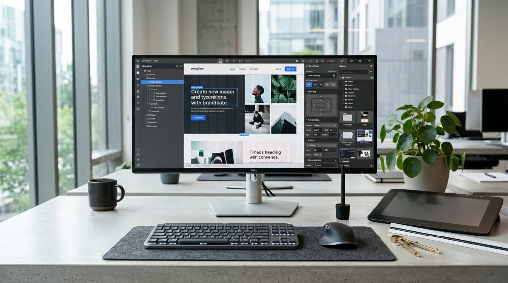
The Webflow Designer is where the actual work of building websites happens. It is a visual interface for constructing web pages without writing code. But it is not a simple drag-and-drop builder like some competitors. The Designer expects familiarity with web design concepts and rewards that familiarity with significant power.
For designers coming from traditional design tools like Figma or Adobe XD, the Designer feels familiar in some ways but different in others. For non-designers, the interface can feel overwhelming initially.
This piece walks through the Designer interface, explaining what each area does and how to work with it effectively.
The Overall Layout
Understanding what you are looking at.
The Canvas
The main area in the middle. Where your website appears as you build it. This is what visitors will see when the site is published.
The Left Panel
Contains multiple tools. Elements you can add. Navigator for page structure. Pages management. CMS access. Symbols and other resources.
The Right Panel
Style controls. Settings for selected elements. Class management. Everything for controlling how elements look and behave.
The Top Bar
Site-wide options. Publish button. Preview mode. Breakpoint selectors for responsive design. Various tools.
The Bottom Panel
When active, shows interactions, animations, and other advanced features.
The Elements Panel
Adding things to pages.
Basic Elements
Fundamental building blocks. Divs, sections, containers, columns. The structural elements.
Text elements. Paragraphs, headings, links.
Media elements. Images, videos, embeds.
Form elements. Input fields, checkboxes, buttons.
How to Add Elements
Drag from the Elements panel to the canvas. Drop where you want the element.
Or use keyboard shortcuts and command palette for faster placement.
Element Structure
Elements can contain other elements. Sections contain containers contain rows contain columns contain content.
Understanding this hierarchy matters for layout.
Semantic HTML
Some elements are semantic (header, footer, main, article, section). Using these correctly helps with accessibility and SEO.
Webflow provides semantic elements. Use them appropriately.
The Navigator
Understanding page structure.
Tree View
The Navigator shows all elements on the page in tree structure. Parent elements contain child elements.
Similar to layers in design tools but focused on HTML structure.
Selecting Elements
Click elements in the Navigator to select them. Especially useful for elements that are hard to click directly on the canvas.
Rearranging Structure
Drag elements in the Navigator to change page structure. Powerful for restructuring layouts.
Renaming Elements
Rename elements for clarity. Especially helpful for complex pages with many similar elements.
The Pages Panel
Managing your site’s pages.
Page List
Shows all pages in your site. Static pages and template pages for CMS.
Adding Pages
Click to add new pages. Enter page name and settings.
Page Settings
Each page has settings for meta tags, custom code, and other page-specific options.
Home Page
One page is designated as the home page. Displayed at the root URL.
Template Pages
For CMS-driven pages. One template generates many pages based on collection items.
The Style Panel
Controlling how elements look.
Class System
Webflow uses CSS classes for styling. Apply a class to elements. Style the class. All elements with that class share the style.
Understanding classes is essential for maintainable projects.
Layout Section
Display type. Flex, block, grid, inline. How the element positions itself and its children.
Position controls. Static, relative, absolute, fixed, sticky.
Spacing Section
Margin and padding. Controls space around and inside elements.
Auto margins for centering. Fixed margins for specific spacing.
Size Section
Width and height. Min and max dimensions. Aspect ratios for maintaining proportions.
Typography Section
Font family, weight, style. Size, line height, letter spacing. Text color, alignment, decoration.
Extensive typography controls.
Backgrounds Section
Background colors. Background images. Gradients. Multiple backgrounds layered.
Borders Section
Border style, width, color. Border radius for rounded corners. Individual border sides.
Effects Section
Shadows. Filters. Opacity. Transformations. Cursor styles.
Transitions Section
Animate property changes. Fade in on hover. Smooth movements. Simple animations without full interaction setup.
Understanding the Box Model
Fundamental concept.
What the Box Model Is
Every element is a box. The box has content, padding around content, border around padding, and margin outside border.
Understanding this concept is essential for CSS-based styling.
Margin Between Elements
Margin creates space between elements. Between siblings, between parent and children.
Padding Inside Elements
Padding creates space inside elements between the edge and the content.
Getting Comfortable
Practice with simple layouts. Adjust margins and padding. See how changes affect the layout.
Flexbox & Grid
Modern layout approaches.
Flexbox
For one-dimensional layouts. Rows or columns of elements.
Powerful for aligning items, distributing space, and creating responsive layouts.
Webflow’s flex controls provide access to CSS flexbox features.
Grid
For two-dimensional layouts. Rows and columns together.
Powerful for complex layouts that flexbox alone cannot handle.
When to Use Which
Flexbox for navigation, button rows, aligned content. Grid for page layouts, card grids, complex arrangements.
Both are essential to master.
Responsive Design
Making sites work on all devices.
Breakpoints
Webflow uses standard breakpoints. Desktop, tablet, mobile landscape, mobile portrait.
At each breakpoint, styles can differ. This is how responsive design works.
The Waterfall Approach
Styles set at desktop cascade down. Styles at tablet override desktop. Mobile overrides tablet. And so on.
Set base styles on desktop. Adjust for smaller screens where needed.
Testing Breakpoints
Switch between breakpoints in the top bar. See how the site looks at each size. Adjust as needed.
Mobile-First vs Desktop-First
You can also work mobile-first. Set styles on mobile. They cascade up to larger screens.
Choose the approach that fits your project.
Interactions Panel
Beyond basic styling.
What Interactions Are
Complex animations and behaviors. Scroll effects. Hover animations. Click effects. Multi-step interactions.
Trigger Types
Different triggers start interactions. Hover, click, scroll, page load, mouse position, and others.
Actions
What happens when triggered. Move elements. Fade. Rotate. Change colors. Chain actions together.
Complexity
Interactions can be simple (hover fade) or complex (multi-step scroll-driven animations).
Start simple. Build complexity gradually.
Performance Considerations
Complex interactions can slow down sites. Use judiciously. Test performance.
Symbols
Reusable components.
What Symbols Are
Elements you can reuse across the site. Header, footer, navigation. Change once, updates everywhere.
Creating Symbols
Select elements you want to reuse. Convert to symbol. Name the symbol.
Using Symbols
Drag symbols from the panel to add them to pages.
Symbol Overrides
Text and specific properties can be overridden per instance while keeping the base design synchronized.
The CMS Panel
For dynamic content.
Collections
Where you manage CMS content. Blog posts, portfolio items, team members. Whatever your dynamic content is.
Creating Collections
Define collection structure. Add fields for the data you need.
Adding Items
Enter content for each item. Similar to database records.
CMS Elements
In the Designer, add CMS elements to display collection content.
The next piece in this series covers Webflow CMS in detail.
Preview & Publish
Seeing your work.
Preview Mode
Preview button in top bar. Shows the site as visitors will see it. No Designer controls.
Testing in Preview
Check that everything works. Links, forms, interactions.
Publishing
Publish button in top bar. Publishes changes to your live site.
Publishes to staging URL and your custom domain if configured.
Publish History
Track previous publishes. Roll back if needed.
Common Designer Mistakes
Users stumble in predictable ways.
Not Using Classes Consistently
Styling elements individually instead of using classes. Creates chaos as sites grow.
Not Organizing Structure
Building layouts without thinking about semantic HTML structure. Affects SEO and accessibility.
Ignoring Breakpoints
Building only for desktop then discovering mobile is broken. Design for all breakpoints throughout the process.
Overusing Absolute Positioning
Absolute positioning is powerful but can create fragile layouts. Use judiciously.
Not Renaming Classes
Default class names (Class 1, Class 2) become unmanageable. Rename for clarity.
Fighting the Tools
Trying to force Webflow to work like traditional design tools. Learning the Webflow way is more productive.
Skipping the Tutorials
Webflow University tutorials are excellent. Skipping them means learning the hard way.
Getting Better at the Designer
Learning strategies.
Webflow University
Official tutorials cover everything. Free. Excellent quality.
Community Resources
Discord servers, YouTube channels, Twitter designers sharing techniques.
Cloneable Projects
Templates you can clone and modify. Great for learning by taking apart existing designs.
Rebuilding Existing Designs
Pick sites you admire. Rebuild them in Webflow. Reveals techniques you would not discover otherwise.
Regular Practice
Skills develop with use. Build regularly. Try new techniques.
Wrapping Up the Designer Overview
The Webflow Designer is powerful once you understand it. What feels overwhelming initially becomes productive with practice. Designers who master it can build sites that would otherwise require developer collaboration.
For new users, the learning curve is real. Working through Webflow University tutorials methodically pays off. Trying to skip the fundamentals leads to frustration.
For designers familiar with web design concepts, the Designer becomes an extension of their design thinking. The tools match how designers approach web layout.
For non-designers, the Designer is more challenging. The design concepts matter. Some learning of basic design principles helps significantly.
The class system is worth learning well. Sites built with proper class discipline are maintainable as they grow. Sites built without class discipline become messes.
The responsive design work matters at every step. Building for one breakpoint and dealing with others as afterthoughts produces problems. Building for all breakpoints throughout produces better results.
Interactions and animations should be used purposefully. They can significantly improve sites when they add real value. They hurt sites when overused or when they distract from content.
Symbols and CMS features let sites scale beyond static designs. Learning them opens the platform’s real capabilities.
For designers evaluating Webflow, spend real time in the Designer before committing to it for actual projects. Build practice sites. See how the workflow feels. Compare to your current tools.
For designers who commit to Webflow, invest in getting good at it. The Designer rewards depth of knowledge. The techniques you learn produce sites you could not build with more limited tools.
For agencies using Webflow, consistency across the team matters. Shared conventions for class naming, structure, and organization make collaboration work.
The Webflow Designer represents a specific approach to web design. Not everyone will love it. But for designers whose thinking aligns with it, the Designer becomes a powerful tool for building custom sites without traditional development. The investment in learning it pays back through every project you build afterward. Take the time to become genuinely proficient, and the Designer becomes a productive foundation for design work rather than something you fight with.